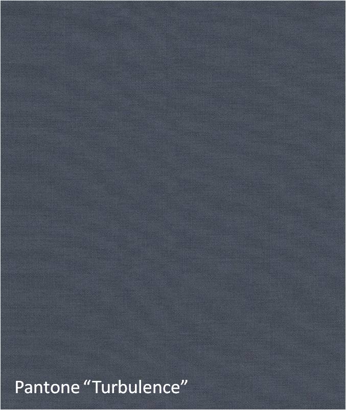
Gray moves through our consciousness like a color that is looking for a friend. If colors were people and had dating sites like match.com, then gray might be a shy but reliable person seeking a more primal mate. The well respected color psychologist, Ms. Angela Wright, on her website Colour Affects, tells us that there are eleven emotional colors and that gray is “psychologically neutral”. Fair enough, but then Pantone in announcing its Fall colors for 2014 includes a color they call “Turbulence”. Perhaps differing from the connotation of its name, this is a fine medium gray value that is shown below.
Not to be outdone, so to speak, Sherwin Williams ushered in two grays in their 2013 forecast. Both “Outerspace” and “Rare Gray” are below. In our view, the former is somewhat blue and the latter extremely cool and these are GOOD things!

The reality is that this is a stone and tile site. Therefore, this blog post must come back to a few tips on using gray as a trending color.
1. Use veining.
Many marbles will feature prominent gray veins that you can use to a very subtle advantage in your design schemes. The setting below shows a silver gray vein contributing to of a whole room statement!
 2. Metals are cool.
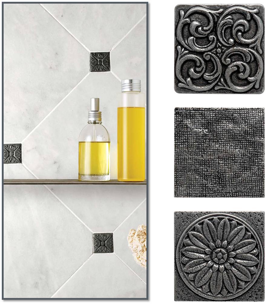
A simple and easy way to use gray is with metal inserts. As you can see, the metal is a supporting player in the design plan!
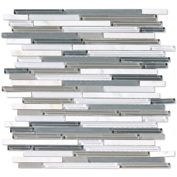
Glass mosaic technology allows for almost infinite color possibilities. So make use of the gray values for backsplashes, feature walls, water based focal points, etc. etc.
The things that you can do with this Color are far too many to be confined to this post. In fact, new interpretations arrive constantly in our showrooms! Marble Systems has locations across America and also in Puerto Rico. For the most hands on and up to date help in working with gray, stop in to one of them for a visit and thanks for reading!


